I’ve spent more time trying Android launchers than I’d like to admit. Every few months I’d switch to a new one, convinced this was finally the launcher that would make my home screen calm.
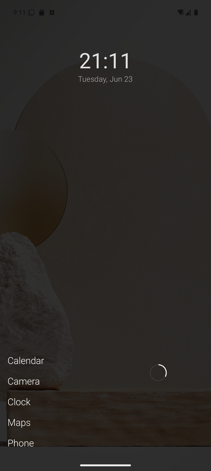
Most of them were good. The minimalist ones especially — I love the idea. Fewer icons, less noise, a home screen that doesn’t fight for your attention.
But after a while, they all started to feel like someone else’s idea of how I should use my phone. I wanted something tailored to my ideas and my workflow. That’s why Zez Launcher exists.
The search-first trade-off
A lot of minimalist launchers are built around search. The home screen stays almost empty, and you type to find everything.
Search is fast, and I use it constantly. But a search-first home quietly takes something away: finger memory.
In a normal icon launcher, you never think about where the Camera app is. It sits in the same spot every day, and your thumb just goes there. That’s not nostalgia — it’s muscle memory, and it’s what makes a phone feel instant.
With search, nothing has a fixed place. Results shift depending on what you typed or what you used recently. Every launch becomes a small decision. It’s quick, but it never becomes automatic.
My phone is not one phone
The other thing I kept running into: I don’t use my phone the same way all day.
Mornings are messages and calendar. Work hours are a handful of tools. Evenings are media, and travel days are maps and tickets. Different scenarios, different apps — and I want the relevant ones close, in a spot my thumb already knows.
Icon grids give you that stability, but bury you in pages of icons. Search-first launchers give you calm, but no stable places at all.
I wanted both.
What Zez does differently
Zez is built around folders that you define — not categories the app invents for you. Each folder is a small, stable list. Apps stay in the same order, in the same position, so your thumb learns where they live. You get the calm of a minimalist launcher without giving up the muscle memory of an icon grid.
The home screen shows one folder at a time, and you cycle between a few of them depending on the context you’re in. Work in the morning, personal in the evening. Same launcher, different face.
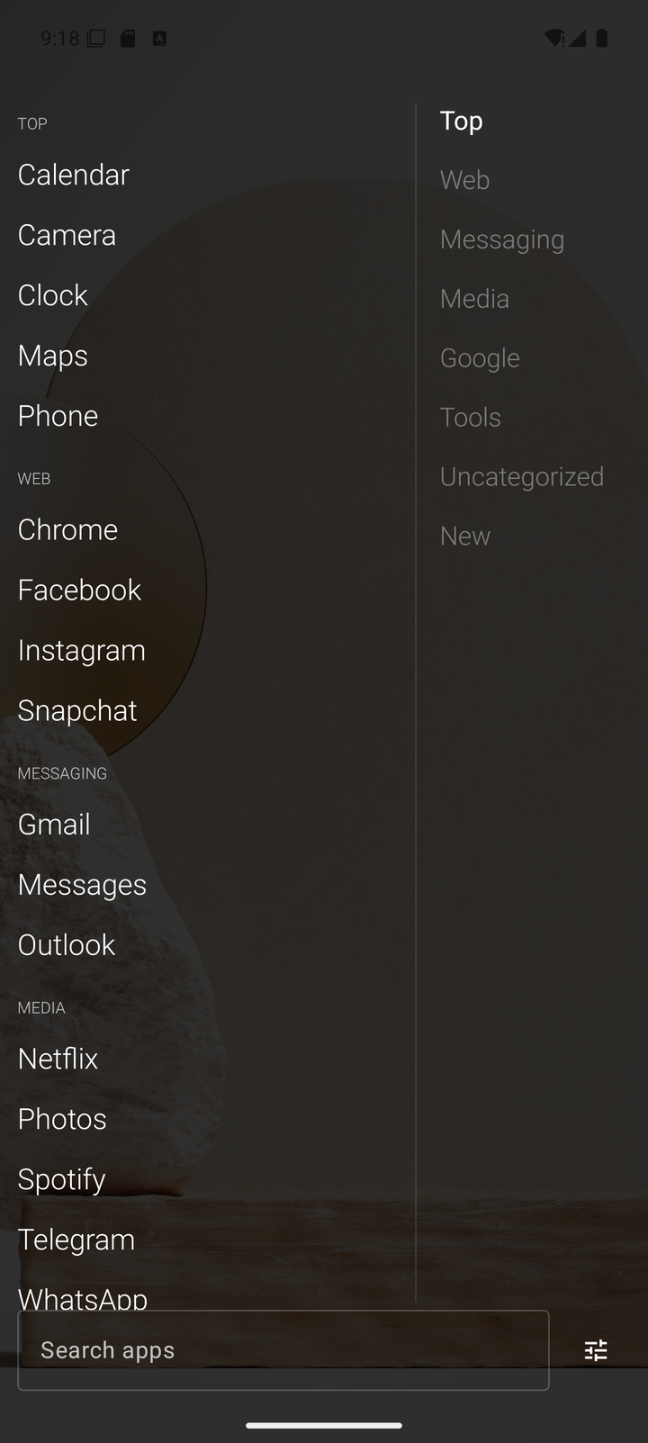
And search is still there, one tap away, for everything else.
Built for my workflow — maybe yours too
I didn’t build Zez to chase a trend. I built it because nothing I tried matched how I actually use my phone. It’s opinionated on purpose: no feeds, no ads, no background noise. When you install a new app, you refresh the list yourself — Zez doesn’t watch installs in the background.
If your brain works like mine — scenarios over icons, memory over search — you might feel at home with it too.
Get Zez Launcher on Google Play
← All posts